02 Mar Smart (?) Pick
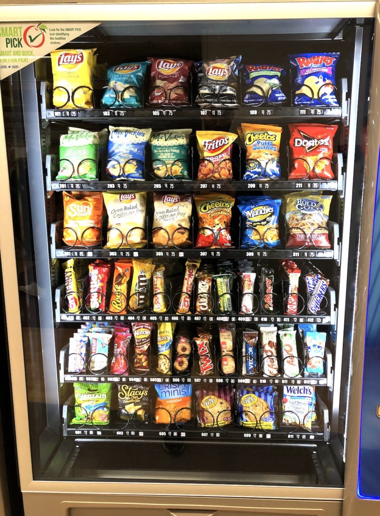
I came across a photo I had taken last May while in the hospital waiting area (at Mt. Sinai in Toronto) with my pregnant partner to have an ultrasound. I had been rushing that day to make the appointment and arrived hungry. I saw the vending machine and was mildly hopeful – my thinking was that a vending machine at a hospital, of all places, might tend to stock more interesting and healthy options, in comparison to its run of the mill subway platform brethren.

So I was wrong. It was essentially the same as any normal North American vending machine, which is to say, junk food, with a Clif bar and some peanuts snuck in. I was a bit annoyed, on my own behalf, but also genuinely surprised that a hospital wouldn’t insist on healthier options. I appreciate that this might not be high on the to-do list of an overburdened health care system, but I really do think that it sets a piss-poor tone.
You may have noted the “Smart Pick” sticker on the top left of the vending machine (slogan: “Smart and quick, a better pick!”). This seems like pretty high hypocrisy – I mean, yes, there are healthier choices. Eating one scoop of ice cream is “healthier” than eating two scoops, but in neither case have you done your body a huge favor. Some items that achieved the coveted “Smart Pick” status?
- Oatmeal and raisin cookies
- Lays Oven-baked BBQ potato chips
- Twizzlers nibs
But fair play for using an apple for their logo. That must have taken balls.
Oh, and who are they, you may ask? The Canadian Automatic Merchandising Association. But, wait a minute, you may again ask, are their incentives actually aligned with healthy eating? Fair point, but don’t worry, they hired the Love Carbs Coach to vet the choices. So we’re good.


